Tag Archives: red

Remembrance

Poppies are one of my favourite flowers. They come in bright beautiful colours and I love seeing a large bed of poppies swaying in a gentle breeze. I have just completed a red poppy on drafting film and took a lot of reference photos at a local park.

Bed of poppies at a local park
It certainly was a challenge drawing the blurred background and rendering all the detail in the centre of the flower but overall I’m happy with the result.

The poppy has long been associated as a symbol of many things, including eternal sleep. The red poppy is known to signify wartime remembrance so it seemed timely to title this drawing ‘Remembrance’ with the Anzac Day Centenary this coming weekend.
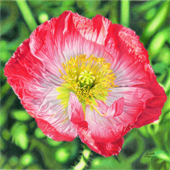
7.5" x 7.5" Faber Castell Polychromos on Drafting Film

7.5″ x 7.5″
Faber Castell Polychromos on Drafting Film

A small way of honouring those who have served Australia and New Zealand in wartime since that historic landing at Gallipoli, Turkey on 25th April, 1915. “Lest We Forget.”


Advertisement

It’s not a bowl of cherries

I have always wanted to draw a bowl of cherries. I had pictured in my mind a monochromatic still life with the cherries as the main focus, resting in a white bowl. One day I walked into a supermarket to purchase some…..couldn’t find them anywhere…..and instead walked out with a collection of round, baby chillies.

My work in progress is pictured below:

8.5" x 7.5" Luminance on grey Stonehenge

8.5″ x 7.5″
Luminance on grey Stonehenge

There are a few firsts for me in this drawing…..the first time I have used my lovely Caran d’Ache Luminance pencils, first time using Stonehenge paper as a support, and first time trying a complementary tonal underpainting (green under red).

The Luminance pencils are a soft, wax-based medium, and even though they are more expensive than other brands, I chose to try them out because of their excellent lightfastness. The leads are encased in California cedar and I find them light and comfortable to hold. It has taken a while to adjust to the paper, it seems soft and ‘spongy’ but appears to be quite durable and capable of taking lots of layers.

I think the paper doily that the bowl is resting on is going to prove to be a challenge and a test of patience!

Red Glow

A slow start to the new year with work commitments but here is the last drawing I completed in October, 2013, titled “Red Glow”, my second piece on drafting film. I took the reference photo of this beautiful red ranunculus and bud in a local park in the early morning light during spring.

8" x 8" Faber Castell Polychromos on Drafting Film

8″ x 8″
Faber Castell Polychromos on Drafting Film

A lot of long hours went into this piece, it certainly was a challenge trying to achieve a soft focus effect in the background! The resulting drawing was submitted for possible inclusion in Ann Kullberg’s CP Treasures Vol II, a book to feature coloured pencil works from around the world. I was so happy to hear a couple of weeks later that it was accepted for publication – there were 600 entries and 81 were selected for the book which arrived in the mail from the United States just after Christmas. There is a wonderful representation of styles and subject matter and I am very honoured to be included alongside such talented artists. Ann wanted to feature a few of the faces behind the art in the January 2014 issue of her CP Magazine and she kindly invited me to be one of them.

CP Treasures Vol II book (left) CP Magazine article (right)

CP Treasures Vol II book (left) CP Magazine article (right)

I also submitted “Red Glow” in CP Magazine subscriber’s 14th Annual Theme Show “Complementary Colors” which went online in November last year. You can browse through a wonderful array of coloured pencil works here.

I am so blessed and grateful to have had these opportunities. Back to the drawing board!